New order funnel
for Amex
American Express is a global leader in financial services, known for its premium credit cards, charge cards and travel-related offerings.
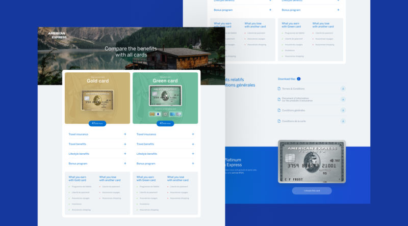
When I worked at Idweaver, Amex asked us to redesign their card comparison landing page and application funnel. The goal was to simplify the user journey and make it easier for prospects to research and apply for the right card. With the UX team, I led the design effort to create a more intuitive, user-friendly experience while maintaining Amex's premium brand identity.
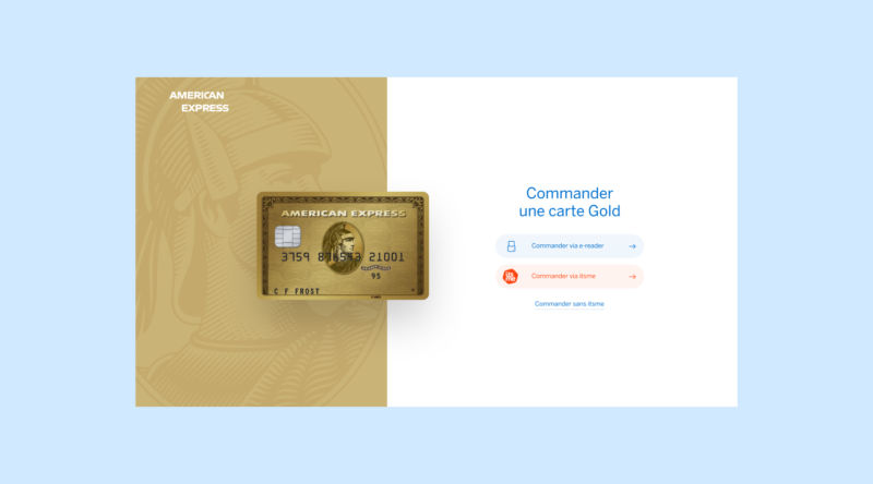
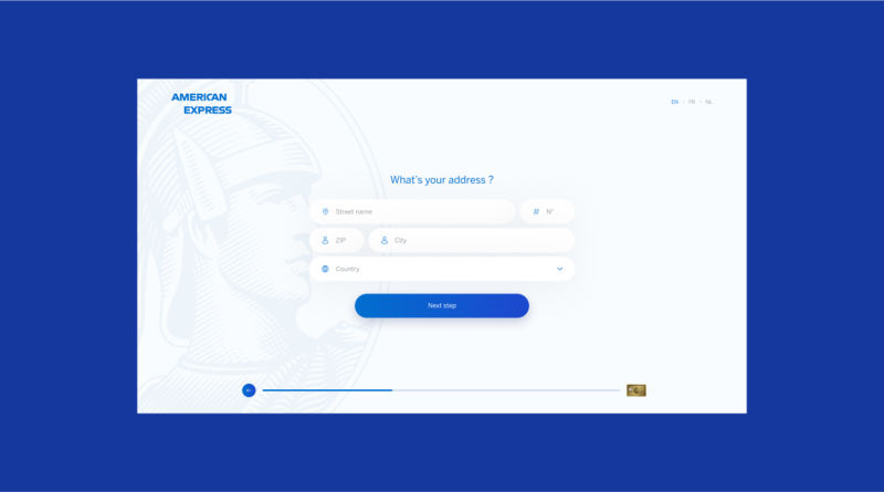
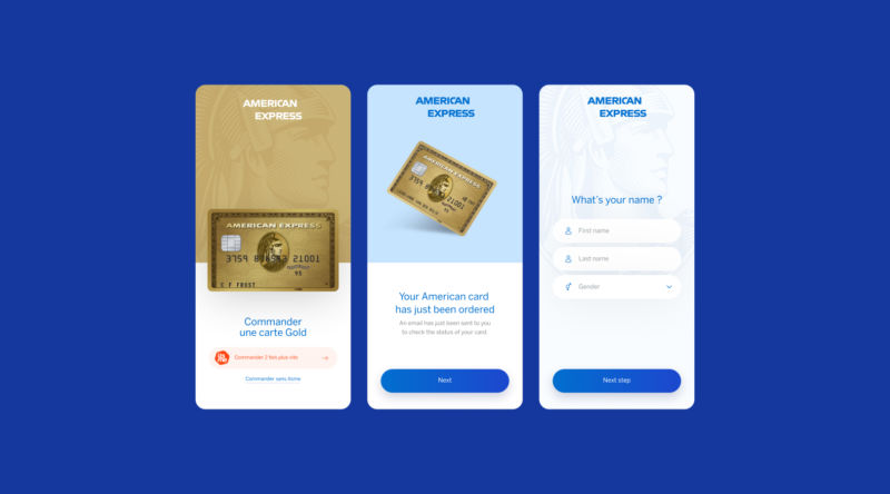
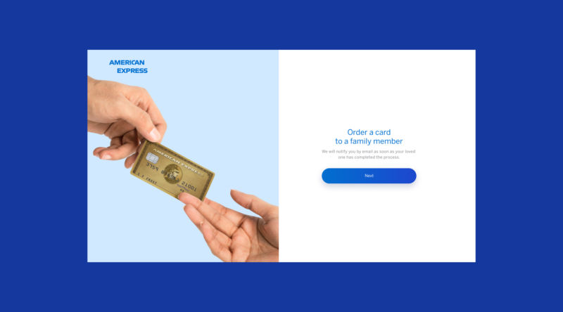
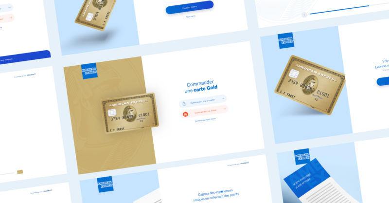
Inspired by Typeform's clean, interactive layout, we redesigned the landing page to clearly present card options in a minimalist design. We focused on making the comparison process simple and highlighting the card's key benefits. The application funnel was streamlined into digestible steps with dynamic features, clear calls to action, and minimal text input to reduce friction.
The goal was to create a seamless, engaging experience that helped users easily find and apply for the card that best met their needs.

